
A written brand system is one short document that sets a company's colors, type, logo rules and templates, so every proposal, letter, email and web page comes out looking like the same company no matter who made it. For a service company that sells through more than one person, it decides whether a salesperson's proposal looks like the company or like whatever that salesperson had open that morning. I designed the brand system for Prime Sweeping, a company I am a partner in, along with the documents that follow it. This article walks through what it holds, how it was built, and why an owner planning a sale should care.
What happens when nobody wrote it down
Most service companies I meet have a logo and a rough sense of their colors. Nothing is written. So each person who makes a document makes their own decisions. One salesperson builds proposals from a template left over from a previous job. Another pastes the logo from the website footer and drags it wider to fill a header. The office manager uses whichever blue the word processor offered first. None of it is wrong on its own, and customers rarely say anything. Put three of those proposals side by side, though, and they look like three small companies.
The second symptom is quieter. In a lot of owner-run companies, the owner is the only person who can make a document look right. Anything important crosses the owner's desk to be fixed before it goes out: the big proposal, the price letter, the page for a new service. That is a small version of the owner dependence a buyer worries about. It is a task only one person can do, and nobody wrote down how.
What a brand system contains
Prime's is called the Brand and Document System, version 1.0. Every Prime page and document follows it. It has six parts, and none of them is long.
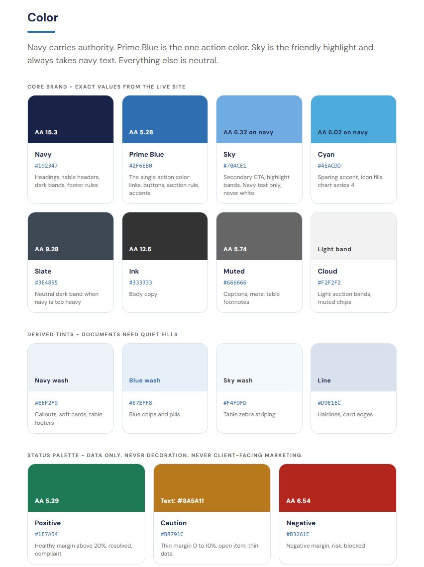
- A palette where each color has a job. Navy carries authority. Prime Blue is the one action color, used for the thing a reader should click or notice first. Sky is the friendly highlight and always takes navy text. Everything else is neutral. Giving each color a job is what keeps people from using all of them at once.
- A status palette for data only. Green, amber and red, the way a scorecard uses them, where green meets the goal and red does not. They are never decoration and never appear in client-facing marketing, so a red cell always means something.
- Two typefaces, and no more. DM Sans for headlines, numbers and screens; Fira Sans for subheads. Two is enough to give a page structure. A third is usually where documents start to look assembled from parts.
- Logo rules. Where the logo may sit, how it is sized and how much room it gets. More on these below.
- Components. The recurring pieces a document is built from, such as tables, headers and footers, decided once and reused everywhere.
- Document and email templates. The starting file for a proposal, a letter or an email, with the system already applied, so nobody starts from a blank page or last year's file.
The templates are where the system pays for itself. Rules on paper help the person who reads them. A template helps everyone who opens it, including the new hire who will never read the rules at all.
Start from the colors the company already has
When an owner hears "brand system," the usual assumption is a new look: a designer, a new logo, a reveal. I went the other way at Prime. The colors were read off the company's own website, which customers had already been looking at. The job was to write down what existed, give each color a job, and check that the combinations actually work.
Checking is the step that tends to get skipped. Every text and background pairing in the palette was contrast tested against WCAG AA, the common accessibility standard for whether text can be read against its background. A pairing that looks fine on a bright office monitor can be hard to read on a phone in daylight or on a page from a tired printer. A rule like "Sky always takes navy text" is the kind of decision that testing settles, and once it is written down nobody has to settle it again.
The same review turned up something worth recording. The company's live website gets its own colors wrong in one place: light text on a sky-blue button, which fails contrast. The brand system says so in writing and says not to copy it. It is a single line, and it matters, because the website is exactly where a staff member goes to find the real colors. Without the note, the one mistake on the site becomes the pattern for every new document. A brand system that records its known mistakes is more useful than one that pretends there are none.
Logo rules, and the two that matter most
Prime's logo rules are short, and they do not change:
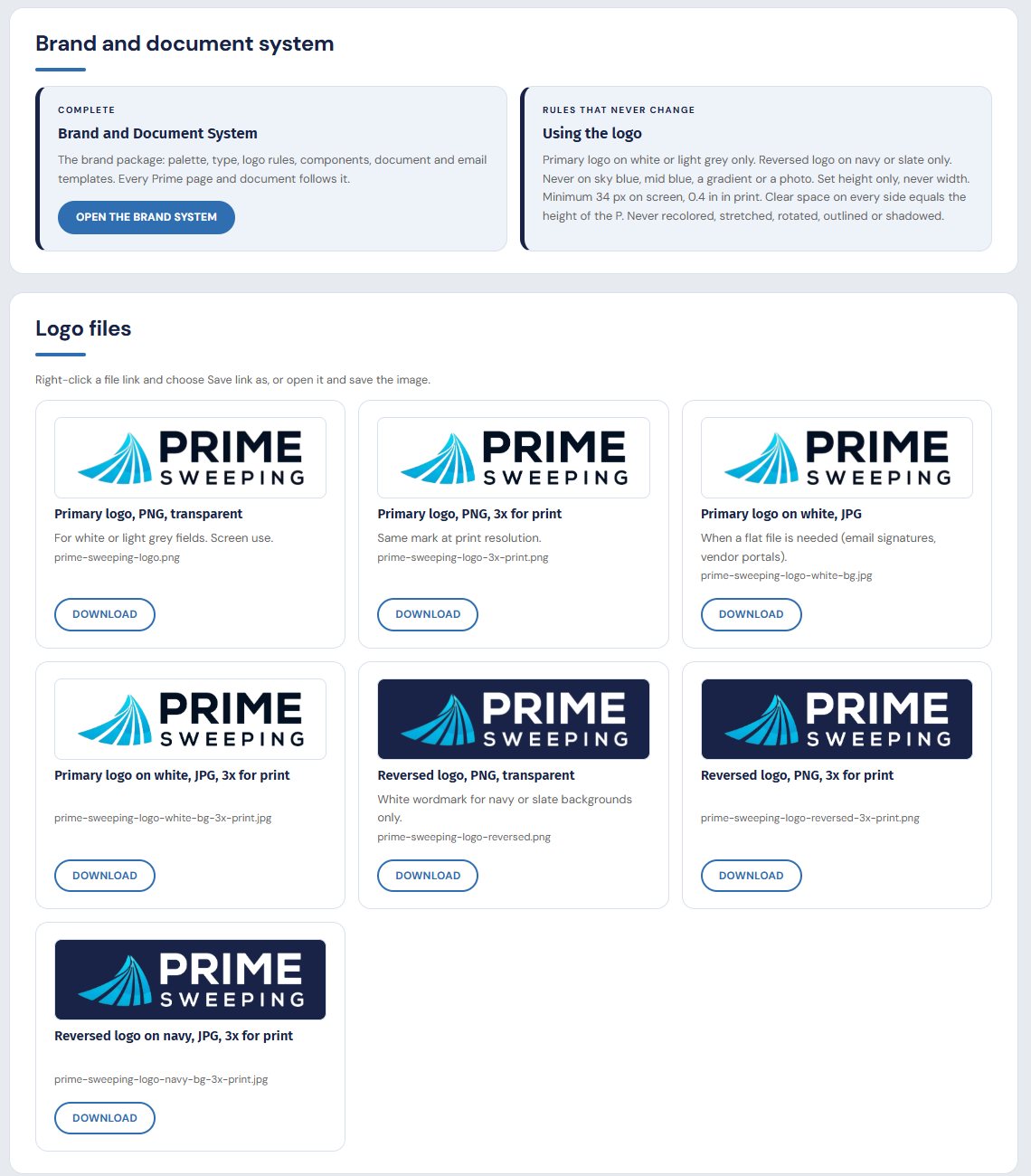
- The primary logo goes on white or light grey only.
- The reversed logo goes on navy or slate only.
- Never on sky blue, mid blue, a gradient or a photo.
- Set the height only, never the width.
- A minimum size on screen and in print.
- Clear space on every side equal to the height of the P.
- Never recolored, stretched, rotated, outlined or shadowed.
"Set height only, never width" sounds fussy until you see what it prevents. Most people resize a logo by dragging an edge or typing a number into a width box, and when width and height are set separately the logo comes out squashed or stretched. It is one of the most common logo mistakes in small-company documents, and readers notice it even when they cannot say what looks off. One sizing rule, set the height and let the width follow, removes the problem for everyone who follows it.
Clear space does a similar job. Tying it to the height of the P gives a measurement that scales with the logo, so the same rule works on a business card and on a banner. Without it, logos end up jammed against a table edge or a line of text, which makes the page look crowded and the company look smaller than it is.
Logo files named for when to use them
Rules do not help if staff cannot find the right file. At most small companies, when someone needs the logo they search the company name on Google and take whatever image comes up: low resolution, wrong background, sometimes an old version. That image then lives in proposals for years.
Prime keeps seven logo files on its staff site, each with a note on when to use it, downloadable by any staff member:
- Primary PNG, for screens.
- Primary PNG at three times the size, for print.
- Primary on white as a flat JPG, for email signatures and vendor portals, and the same file at three times the size.
- Reversed PNG, for dark backgrounds, and the same at three times the size.
- Reversed on navy as a flat JPG at three times the size.
The flat JPGs are there for a practical reason. Email signatures and vendor portals can handle a transparent PNG badly, and a logo with a transparent background may land on a grey or dark field it was never drawn for. A file already set on white avoids the question. Naming each file for the situation it serves is what gets staff to pick the right one. They download it from the same place they find the handbook and the forms, and the Google search stops.
How consistency connects to value
I will keep this claim modest, because it is easy to overstate. A brand system does not change earnings, and no buyer pays more for a color palette. What it changes is what people infer about the company from its paper.
A customer who receives a proposal, then the standard terms, then an annual price letter, all in the same colors, type and layout, reads a company with a process behind its paperwork. That reads as a steadier and larger company than one whose documents each look homemade. At Prime the client-facing material is written for customers and carries no internal figures, and the Standard Terms attach to every proposal, so the consistency runs through the documents that matter most at renewal.
A buyer draws a similar inference from a different angle. In diligence a buyer reads a lot of the company's paper: proposals, contracts, the handbook, procedures. When all of it follows one system, that is evidence the company produces its documents the same way whoever makes them. It is the question a buyer asks about every part of the business: does this run without the owner? Written procedures answer it for operations, which I cover in the written procedures buyers expect. A brand system answers it for the company's face, and consistent templates are one part of sales material that sells without the owner in the room.
Where it lives, and how to start
At Prime the brand system sits on the Marketing and brand page of the staff site, next to the logo files and the client-facing packets. You can see that page, with the rest of the site, on What We Built. Keeping it where staff already go for forms and procedures is a large part of why it gets used.
If you want to start one, a reasonable order is this. Pull the colors off your own website and write down a job for each. Test the text pairings for contrast. Pick two typefaces. Write the logo rules. Export the logo files and name them for their use. Then build templates for the three documents your team sends most, and note anything on the current site that breaks the rules so nobody copies it.
This is part of the systems work I do with owners one to three years before a sale, described on our consulting page. If your proposals look different depending on who sent them, or everything important still crosses your desk to be fixed, I am glad to talk it through. You can book a time here.